Categories
Tips

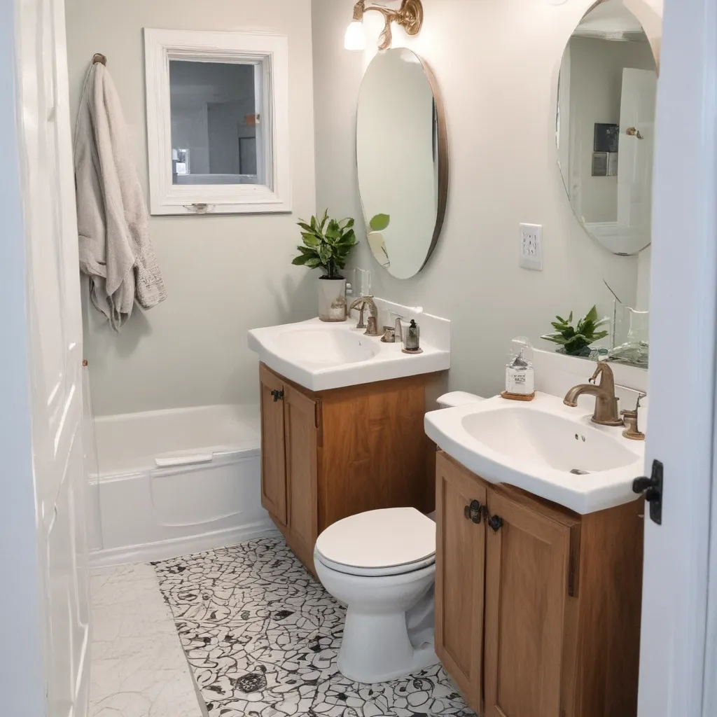
Spruce Up Your Bathrooms Look with Easy Hardware Upgrades

Spruce Up Your Bathrooms Look with Easy Hardware Upgrades

From Drab to Fab: Transforming Your Bathroom on a Dime

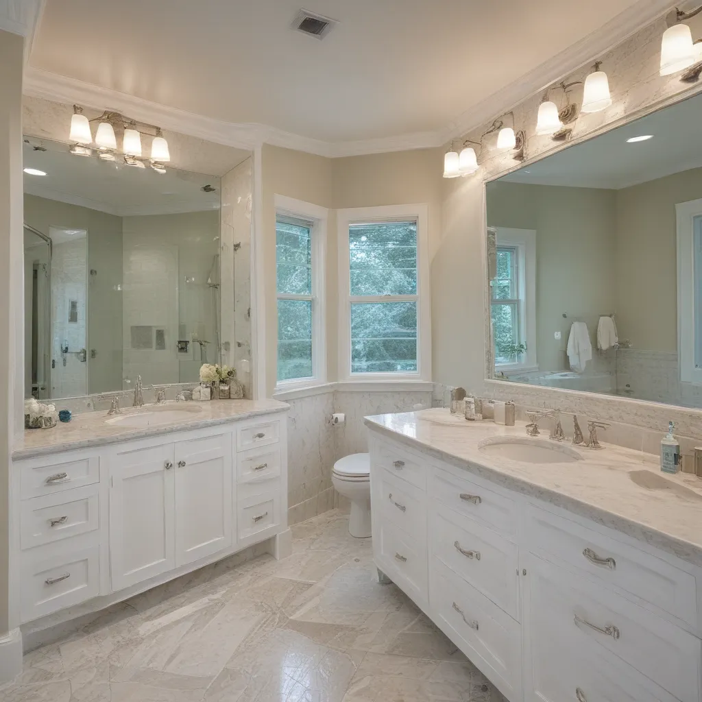
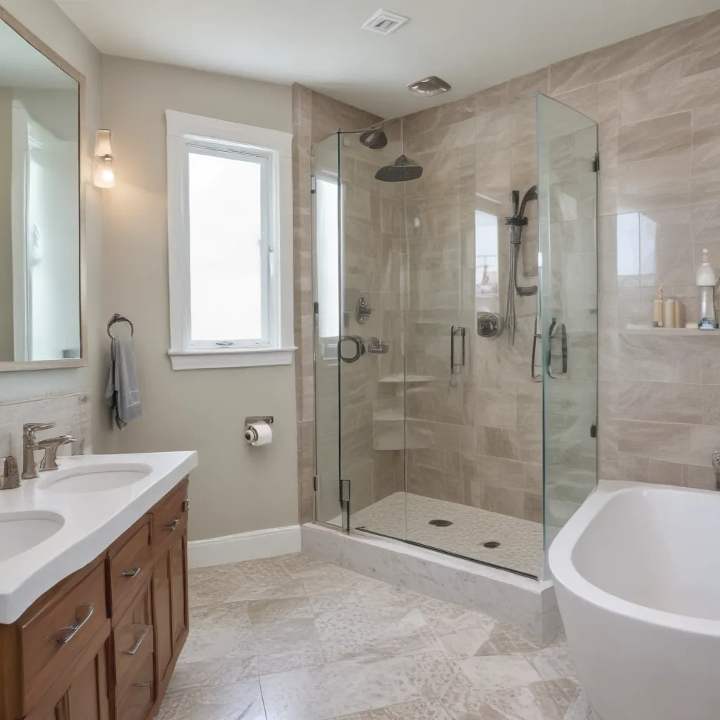
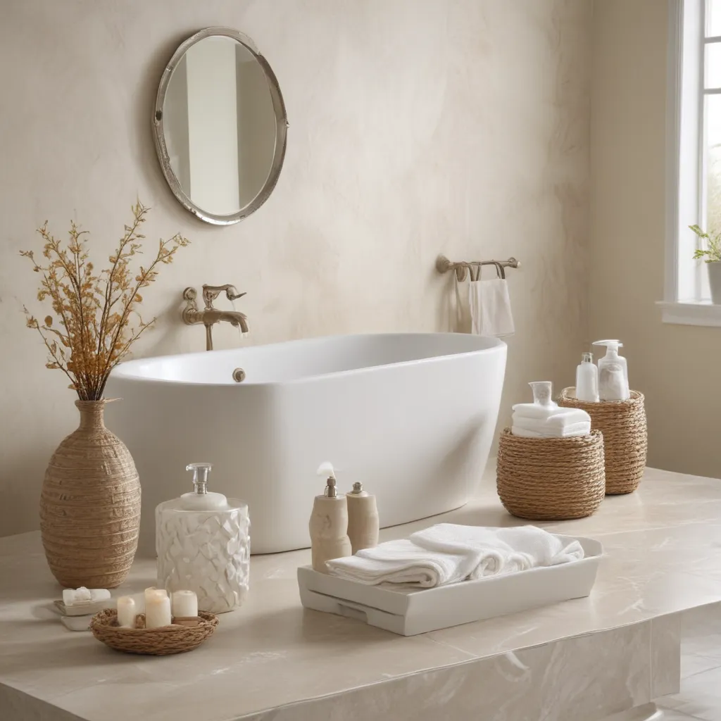
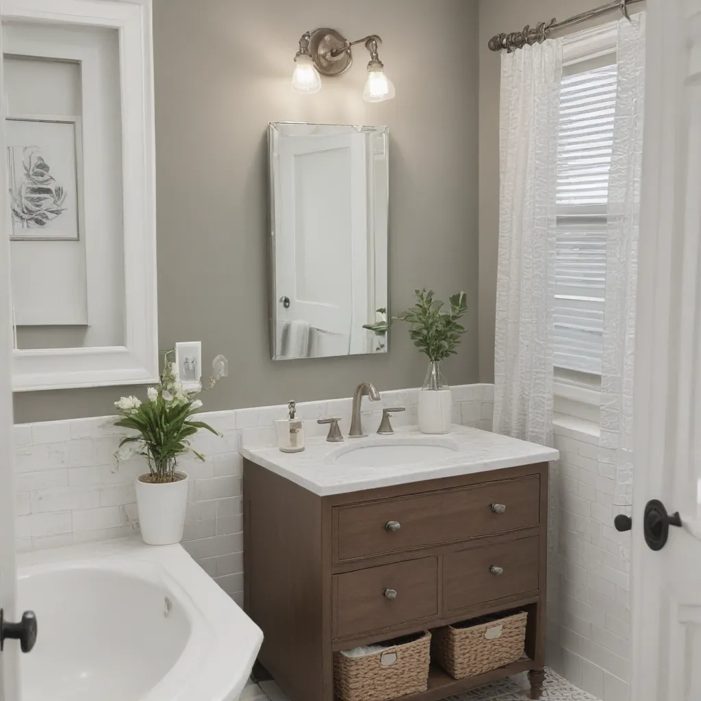
Are you tired of staring at the same old, outdated bathroom hardware day after day? Well, my friend, have I got the solution for you! Buckle up, because I’m about to show you how you can spruce up your bathroom’s look with some easy, budget-friendly hardware upgrades.

Unlocking the Power of Hardware

It’s amazing how something as simple as swapping out your cabinet knobs and drawer pulls can completely revitalize the vibe of your bathroom. Think about it – those little metal accents are often the first thing your eyes are drawn to when you walk in. So, if they’re looking drab and dated, it can instantly make the whole space feel, well, blah.

But fear not, my DIY-loving friends! With a few strategic hardware upgrades, you can turn that blah bathroom into a sparkling oasis of style. And the best part? It doesn’t have to cost an arm and a leg. In fact, I’m about to share some super easy (and budget-friendly) ways to give your bathroom a facelift that’ll have your guests thinking you spent a fortune. [1]

Brass is the New Black

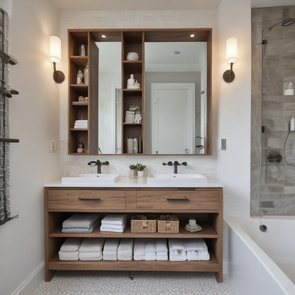
One of the hottest hardware trends right now is the rise of antique brass. Gone are the days of sleek, shiny nickel – now it’s all about that warm, vintage-inspired look. And you know what? It happens to be one of the easiest upgrades you can make. [2]

All you need is a little brass darkening solution and some good ol’ steel wool, and you can transform your plain-Jane hardware into a show-stopping, aged brass masterpiece. Just dip, brush, and buff – it’s seriously that simple. [2] The result? A custom, high-end look that’ll have your bathroom feeling like a million bucks, without the hefty price tag.

Mix and Match for Maximum Impact

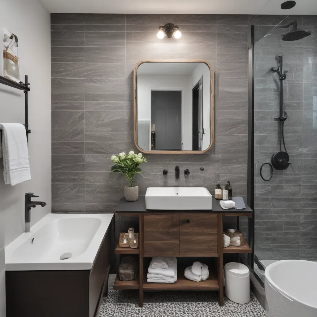
Now, if you really want to take your bathroom hardware game to the next level, try mixing and matching different finishes. For example, you could pair sleek black pulls on your vanity drawers with brushed nickel knobs on your cabinet doors. Or, go for a modern farmhouse vibe with a combination of matte black and antique brass accents. [6]

The key is to choose a maximum of two metals and stick to that palette throughout the space. This creates a cohesive, intentional look that’ll make your bathroom feel like it was designed by a pro. [6] Trust me, your friends will be green with envy when they see how effortlessly chic your freshly-updated bathroom looks.

Drawer Pulls vs. Cabinet Knobs: The Great Debate

Now, I know what you’re probably thinking – do I go with knobs or pulls? It’s a tale as old as time, my friends. But fear not, I’m here to settle the score once and for all. [6]

Generally speaking, I like to see a combination of both in a bathroom. Knobs for the cabinet doors, and pulls for the drawers. This creates a nice visual balance and prevents the space from feeling too “matchy-matchy.” [6] Plus, it allows you to have a little fun with mixing up the styles and finishes.

That being said, I’ve also seen stunning bathrooms that went with an all-pull or all-knob approach, and they totally nailed it. So, don’t be afraid to experiment and find what works best for your space. [6] At the end of the day, the most important thing is that you love the way it looks.

Don’t Forget the Details

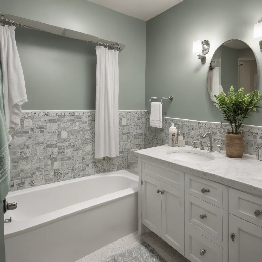
Now, we’ve covered the big stuff – the cabinet hardware. But let’s not forget about the little details that can really make a difference. Think about upgrading your faucet, towel bars, toilet paper holder, and even your light fixtures. [7]

These small touches may seem insignificant, but trust me, they can really elevate the overall look and feel of your bathroom. Plus, you can continue that mix-and-match hardware theme throughout the space for a cohesive, designer-approved vibe.

From Drab to Fab in No Time

So, there you have it, my friends – your roadmap to transforming your bathroom from drab to fab with some easy hardware upgrades. Whether you opt for a bold, antique brass look or a sleek, modern mix of finishes, I can guarantee that your space will feel like a completely new oasis.

And the best part? You don’t have to break the bank to do it. With a little creativity and a few simple DIY tricks, you can create a bathroom that looks like it was straight out of a designer magazine. [3] [4] [5] [8]

So, what are you waiting for? Grab your toolbox, and let’s get to work sprucing up that bathroom of yours. Trust me, your future self (and all your guests) will thank you.

Categories
Tips

Bathroom Remodeling Cost Breakdown

Bathroom Remodeling Cost Breakdown

The Bathroom Remodel That Caught Us By Surprise

You know those home renovation shows on TV where they make a complete bathroom overhaul look like a breeze? Well, buckle up, my friends, because the reality of a bathroom remodel is a whole different story! When our master bathroom suddenly became an emergency situation due to water damage, we had to jump into action – and let me tell you, we were so not prepared for the roller coaster ride that was about to unfold.

As first-time homeowners with a bit of DIY experience under our belts, we thought we had a decent handle on what to expect when it came to home projects. But this bathroom remodel was like a crash course in unexpected costs, tricky contractors, and just how quickly a simple renovation can spiral out of control. Looking back, I wish we had known a little more about the true price tag of a bathroom makeover before diving in headfirst.

Luckily, we learned a lot along the way, and I’m here to share our full budget breakdown so you can approach your own bathroom remodel with a little more foresight. From the nitty-gritty details of every expense to the money-saving tips we wish we’d known, this is the insider scoop on what it really takes to transform your tired, old bathroom into a stunning new oasis. Buckle up, because this is one wild ride you won’t want to miss!

Breaking Down the Bathroom Remodel Costs

When we first started this project, I had absolutely no idea what to expect in terms of costs. I mean, how much could a simple bathroom update really set us back? Well, let me tell you – the final price tag was a whole lot steeper than we ever could have imagined.

Let’s dive into the nitty-gritty details, shall we? Our 60-square-foot master bathroom remodel ended up costing us a grand total of $35,000. Yep, you read that right – $35,000! [1] And that was after going through the wringer with our insurance company and contractors to try to keep costs down as much as possible.

Now, I know what you’re thinking – how on earth could a tiny bathroom cost that much?! Well, my friends, the answer lies in the sheer number of moving parts involved in a full-scale renovation like this one.

First, there was the demolition and drywall work, which set us back about $5,000. [1] Then came the plumbing, which racked up another $5,000 in expenses. [1] Electrical work and lighting? Another $3,000. [1] And the real kicker? The tile work – a whopping $10,000 for the installation alone. [1]

But wait, there’s more! We also had to factor in the cost of the vanity, countertops, shower door, and all the other fixtures and finishes that brought our dream bathroom to life. When it was all said and done, those additional materials and decor items tacked on another $12,000 to the final price tag. [1]

Whew, just typing all of that out has me feeling a little lightheaded. And let me tell you, the sticker shock was real when we saw the final bill. But you know what they say – hindsight is 20/20, and boy, do we have a whole new appreciation for the true cost of a bathroom remodel.

Tips for Saving Money on Your Bathroom Renovation

Now, I know what you’re thinking – there’s no way I can afford a $35,000 bathroom makeover! Trust me, I get it. When we were hit with that final price tag, I think my jaw hit the floor. But the good news is, there are plenty of ways to save money and keep your bathroom renovation within a reasonable budget.

First and foremost, communication is key. [1] Make sure you’re upfront with your contractors about your budget from the very beginning, and don’t be afraid to ask questions about the cost of each individual project. Knowing the price tag ahead of time will give you the flexibility to pivot and find more budget-friendly alternatives as needed.

Another big money-saving tip? DIY as much as you can. [1] Robert and I ended up tackling a bunch of the finishing touches ourselves, like installing the picture frame molding, hanging the mirrors, and even doing some of the caulking and patching work. Not only did this save us a bundle on labor costs, but it was also a great way for us to put our own personal stamp on the space.

And don’t forget to shop around for materials! [1] Sure, it might be easier to just let your contractor handle all the purchasing, but trust me, you’re going to end up paying a premium for that convenience. Instead, take the time to scour the web, browse local home improvement stores, and even check out secondhand shops for hidden gems. You’d be amazed at the deals you can score if you’re willing to put in a little legwork.

At the end of the day, a bathroom remodel is a big investment, both financially and emotionally. But with a little creativity, some good old-fashioned DIY spirit, and a whole lot of grit, you can absolutely transform your tired old bathroom without breaking the bank. Trust me, it’s a wild ride, but the end result is so, so worth it.

The Surprising Lessons We Learned Along the Way

As if the sticker shock of our bathroom remodel wasn’t enough, we also had to navigate a whole host of other challenges and surprises along the way. From dealing with tricky contractors to navigating the ups and downs of working with our insurance company, this project was anything but smooth sailing.

One of the biggest lessons we learned? Always, always, always communicate your budget upfront. [1] When we first started this project, we were so focused on getting the job done that we didn’t really take the time to sit down with our contractors and discuss our financial limitations. Big mistake. By the time we finally spoke up, the costs had already spiraled out of control, and we were left scrambling to find ways to scale things back.

Another eye-opener? The true impact of supply chain issues and labor shortages. [2] In the midst of our remodel, the COVID-19 pandemic was in full swing, and it seemed like every time we turned around, there was another delay or price hike due to material scarcity or a lack of available workers. It was incredibly frustrating, and it just goes to show how quickly a renovation can go off the rails when external factors come into play.

But perhaps the most valuable lesson we took away from this whole experience? The power of DIY. [1] When the final cost estimates came in, we knew we had to get scrappy if we wanted to stay on budget. So, Robert and I rolled up our sleeves and dove headfirst into all sorts of finishing touches, from installing the picture frame molding to hanging the mirrors and even doing some of the caulking and patching work. Not only did this save us a ton of money, but it also gave us a real sense of pride and ownership over the final product.

At the end of the day, a bathroom remodel is a wild ride, full of surprises and challenges at every turn. But if you’re willing to put in the work, stay adaptable, and get a little creative, you can absolutely transform your tired old space without breaking the bank. Trust me, we learned that lesson the hard way – but the end result was so worth it.

The Pros and Cons of a Bathroom Remodel

Now, I know what you’re thinking – with all the stress and headaches, was this bathroom remodel really worth it in the end? Well, let me tell you, it’s a bit of a mixed bag.

On the one hand, the final result is absolutely stunning. [1] Our once-dated, water-damaged bathroom is now a true oasis – complete with a sleek, modern vanity, a spa-worthy shower, and all the high-end finishes we’ve always dreamed of. It’s the kind of space that makes you want to linger a little longer, soaking in the serene atmosphere and admiring all the careful details.

But on the other hand, the journey to get here was anything but smooth. [1] From the sticker shock of the final price tag to the endless delays and surprises along the way, this remodel was a true test of our patience and perseverance. And let’s not forget the sheer upheaval of living without a functional bathroom for months on end – talk about a major inconvenience!

So, is it all worth it in the end? Well, that’s a question only you can answer. For us, the stunning final result was absolutely worth the blood, sweat, and tears (and the $35,000 price tag). But I’d be lying if I said there weren’t times during the process where we seriously questioned our sanity.

At the end of the day, a bathroom remodel is a major investment, both financially and emotionally. But if you’re willing to buckle up for the ride, get creative with your budget, and embrace the unexpected, the payoff can be truly transformative. Just be prepared for a few bumps along the way – because trust me, this is one wild rollercoaster you won’t soon forget.

References

[1] Knowledge from https://www.blesserhouse.com/bathroom-remodel-cost-our-full-budget-breakdown/

[2] Knowledge from https://www.angi.com/articles/how-much-does-bathroom-remodel-cost.htm

Categories
Tips

Common Bathroom Remodeling Mistakes

Common Bathroom Remodeling Mistakes

Rushing Into the Design Process

As a self-proclaimed bathroom renovation enthusiast, I’ve learned the hard way that you can’t just dive headfirst into a project and expect it to turn out perfectly. When I first decided to remodel my outdated bathroom, I’ll admit I got a bit overzealous. I spent hours scrolling through Pinterest, bookmarking every gorgeous vanity and sleek tile pattern I laid eyes on. I thought I had a crystal clear vision in my mind and couldn’t wait to bring it to life.

But boy, was I in for a rude awakening. Once I started meeting with contractors and sourcing materials, I quickly realized just how many factors go into a successful bathroom overhaul. From plumbing and electrical considerations to figuring out the optimal layout, there’s a lot more to it than picking out pretty finishes. I ended up making numerous changes to my initial design plan, which ultimately delayed the project and added unexpected costs.

Looking back, I wish I had taken the time to really think through all the functional requirements before getting swept up in the aesthetic side of things. [1] Planning ahead is crucial when it comes to bathroom renovations – you need to account for everything from ventilation and storage to accessibility and water drainage. Rushing into the design process without carefully weighing all the practical implications can lead to a lot of headaches down the line.

Skimping on Ventilation

Another rookie mistake I made during my bathroom renovation was underestimating the importance of proper ventilation. I’ll admit, it wasn’t the first thing on my mind when I was busy daydreaming about freestanding tubs and heated floors. But as it turns out, overlooking this crucial element can have some seriously damaging consequences.

You see, bathrooms are naturally damp, humid environments – especially after a steamy shower. If that excess moisture doesn’t have a way to escape, it can lead to all kinds of issues like mold, mildew, and peeling paint or wallpaper. Not exactly the tranquil, spa-like oasis I was going for. [2]

I learned this the hard way when, a few months after completing the renovation, I started noticing unsightly black spots creeping up the walls. Turns out the ventilation system I had installed wasn’t sufficient to properly circulate the air and remove the moisture. I ended up having to call in a mold remediation specialist, which was a massive headache and an unnecessary expense.

Now, I always make sure to work closely with HVAC professionals to ensure the bathroom has adequate ventilation, whether that’s through a powerful exhaust fan, strategically placed windows, or a combination of the two. It may not be the most glamorous aspect of a bathroom remodel, but it’s absolutely essential for maintaining a healthy, mold-free space.

Neglecting Lighting

When it comes to bathroom design, I’ll admit I have a bit of a lighting obsession. In my opinion, the right lighting scheme can truly make or break the entire ambiance of the space. But I’ve learned through trial and error that it’s not as simple as just slapping up a few overhead fixtures and calling it a day.

In fact, one of the biggest mistakes I see homeowners make is relying solely on a single, harsh overhead light. Sure, it may provide ample illumination, but it also tends to cast unflattering shadows and create a rather stark, clinical feel. [3] Bathrooms should be warm and inviting, not the kind of place that makes you feel like you’re under a microscope.

That’s why I always advocate for a layered lighting approach, with a combination of ambient, task, and accent lighting. Recessed cans for general illumination, wall sconces flanking the vanity mirror for flattering task lighting, and a statement pendant or chandelier to add a touch of elegance. And don’t forget about incorporating dimmers – being able to adjust the brightness is key for setting the right mood, whether you’re getting ready in the morning or winding down with a relaxing soak.

Neglecting Storage

Let’s be real – bathrooms tend to accumulate a lot of stuff. Between towels, toiletries, cleaning supplies, and all the other daily necessities, it’s easy for the space to quickly become cluttered and chaotic. That’s why incorporating ample storage is such a crucial element of any successful bathroom remodel.

Yet, time and time again, I see homeowners skimping on this essential component. They’ll focus all their energy and budget on selecting the perfect vanity, tile, and fixtures, only to realize too late that they have nowhere to stash their stuff. Suddenly, those beautiful surfaces are covered in a jumble of cotton balls, half-used shampoo bottles, and who knows what else.

[4] When planning my own bathroom reno, I made sure to dedicate a significant portion of the budget towards built-in storage solutions. Recessed medicine cabinets, vanity drawers, shelving niches – you name it, I wanted it. And let me tell you, that extra investment has paid off in spades. Not only does my bathroom look clean and clutter-free, but I have easy access to all my daily essentials without having to hunt through a mess.

So if there’s one piece of advice I can impart, it’s this: Don’t skimp on storage! Take the time to carefully assess your needs and plan out the perfect organizational system. Your future self (and your guests) will thank you.

Ignoring the Importance of Proper Drainage

As someone who has had their fair share of plumbing mishaps, I can attest to the vital importance of proper drainage in a bathroom. It may not be the most glamorous aspect of the renovation process, but getting the underlying infrastructure right is absolutely crucial.

You see, bathrooms are inherently prone to water damage due to the nature of the space. Between the shower, sink, and potential tub, there’s a lot of liquid flowing around. And if that water doesn’t have a clear path to exit, it can lead to all sorts of issues – from unsightly leaks and stains to more serious structural damage.

[5] I learned this the hard way when, shortly after completing my bathroom remodel, I started noticing water pooling on the floor around the shower. Turns out the contractor I had hired had not properly graded the shower floor, causing the water to accumulate rather than drain away efficiently. It was a nightmare to deal with, requiring a complete tear-out and re-tiling of the entire shower area.

Needless to say, I now make sure to work closely with plumbers and contractors to carefully plan the drainage system before any construction begins. From strategically placing floor drains to ensuring the right slope on the shower pan, no detail is too small when it comes to preventing costly water damage down the line.

Selecting the Wrong Materials

When it comes to bathroom renovations, the materials you choose can make all the difference in the world. After all, this is a space that needs to withstand constant exposure to moisture, humidity, and sometimes even harsh cleaning products. Select the wrong materials, and you could be dealing with mold, mildew, and all sorts of other unpleasant issues.

One common mistake I see homeowners make is falling in love with high-maintenance materials like natural stone. Yes, marble and travertine have a certain luxurious appeal, but they also require regular sealing and cleaning to prevent staining and etching. [6] And let’s not even get started on the nightmare that is trying to keep white grout looking pristine in a busy family bathroom.

Instead, I always recommend opting for more durable, low-maintenance options like porcelain or ceramic tile. These surfaces not only stand up better to water and wear-and-tear, but they’re also a breeze to keep clean. And with the endless array of styles and patterns available these days, you can absolutely achieve that high-end look without the headache.

The same goes for plumbing fixtures and hardware. Cheap, low-quality materials may seem like a budget-friendly solution in the moment, but they’re far more likely to corrode, leak, or break down over time. Invest in quality pieces from reputable brands, and you’ll save yourself a lot of hassle (and money) in the long run.

Attempting DIY Projects Beyond Your Skill Level

As someone who loves a good DIY project, I totally understand the allure of tackling parts of a bathroom renovation yourself. After all, it can be a great way to save some cash and really put your personal stamp on the space. But I’ve also learned the hard way that there are certain tasks that are best left to the professionals.

Case in point: my disastrous attempt at tiling the shower surround in my last bathroom remodel. I thought, “How hard could it be?” Famous last words. Long story short, I ended up with crooked, unevenly spaced tiles that were a total eyesore. And don’t even get me started on the leaks that started popping up a few months later.

[7] Turns out, properly installing tile – especially in a high-moisture area like a shower – requires a level of skill and expertise that I simply didn’t possess. I ended up having to call in a professional tile contractor to redo the entire thing, which ended up costing me way more than if I had just hired them in the first place.

The moral of the story? Know your limits. Painting, updating light fixtures, and even hanging vanity mirrors are all fair game for DIY-ers. But when it comes to anything involving plumbing, electrical work, or intricate tiling, it’s best to leave it to the pros. Trust me, it’s worth the investment to ensure the job is done right the first time.

Overlooking the Long-Term Needs of the Space

As someone who has gone through multiple bathroom renovations, I’ve learned that it’s not enough to simply create a space that looks good in the moment. You also need to consider how the design will hold up and function over time, especially as your needs and lifestyle evolve.

One mistake I see homeowners make time and time again is failing to think ahead. They get so caught up in selecting the latest trendy tiles or that gorgeous freestanding tub that they forget to consider factors like accessibility, storage capacity, and overall long-term usability.

[8] Take my recent bathroom remodel, for example. When I was planning the layout, I made sure to incorporate features that would accommodate my family’s changing needs down the line. The vanity has ample drawer space to store everything from towels to hair products. The shower has a built-in bench and handheld sprayer, making it easy to use for people of all ages and abilities. And the overall design is clean and timeless, so I know it won’t feel dated in a few years.

By taking a more holistic, forward-thinking approach, you can ensure your bathroom renovation stands the test of time. Sure, it may require a bit more upfront planning and investment. But trust me, it’s worth it to have a space that truly works for you, now and in the years to come.

Conclusion

Embarking on a bathroom renovation can be an incredibly exciting and rewarding process. But as I’ve learned the hard way, it’s also fraught with potential pitfalls that can quickly turn your dream project into a nightmare.

From neglecting crucial elements like ventilation and storage to attempting DIY tasks beyond your skill level, the list of common mistakes is endless. And the consequences can be downright disastrous – think mold, water damage, and wasted time and money.

But the good news is, with a little foresight and planning, you can avoid these costly missteps. By taking the time to carefully consider all the functional requirements of your bathroom, selecting durable materials, and enlisting the help of professionals when needed, you can ensure your renovation is a smooth and successful endeavor.

So before you start ripping out tiles or browsing the latest bathroom vanity trends, take a step back and really think through every aspect of the project. Trust me, your future self (and your wallet) will thank you.

[1] https://www.architecturaldigest.com/story/bathroom-renovation-mistakes
[2] https://jillianlare.com/bathroom-remodeling-mistakes/
[3] https://stylebyemilyhenderson.com/blog/bathroom-renovation-mistakes-and-tips
[4] https://www.marthastewart.com/8387320/bathroom-renovation-mistakes
[5] https://www.tileclub.com/blogs/news/10-common-bathroom-remodel-mistakes-and-how-to-avoid-them
[6] https://www.homesandgardens.com/ideas/bathroom-remodel-mistakes
[7] https://kitchensbyeileen.com/2023/01/20/bathroom-renovation-mistakes/
[8] https://nvkitchenandbath.com/bathroom-remodeling-mistakes/

Categories
Tips

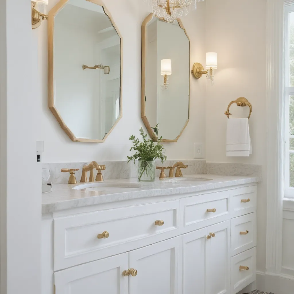
Comfortably Adorn Your Bathroom with These Cozy Accessories

Comfortably Adorn Your Bathroom with These Cozy Accessories

Crafting a Serene Sanctuary

As I stepped into my newly renovated guest bathroom, I couldn’t help but feel a sense of tranquility wash over me. The space had been transformed from a sterile, utilitarian area into a cozy oasis where I could unwind and indulge in a little self-care. Gone were the stark, clinical fixtures and bare walls – in their place, a symphony of warm textures, soothing colors, and thoughtful accents that made the room feel like a true escape.

The key to creating this inviting atmosphere? Carefully selected bathroom accessories that not only served a practical purpose but also elevated the overall aesthetic. From plush towels and luxurious bath mats to decorative shelves and artfully placed greenery, each element worked in harmony to craft a space that was as visually appealing as it was comfortable.

Softening the Edges with Textiles

One of the first things I noticed upon entering the newly refreshed guest bathroom was the abundance of soft, cozy textiles. Gone were the scratchy, utilitarian towels of the past, replaced by thick, fluffy towels in a calming neutral palette. The simple act of wrapping myself in these decadent linens after a relaxing soak made me feel like I was being enveloped in a warm hug.

But the textiles didn’t stop there. A large, plush bath mat greeted my feet as I stepped out of the shower, its luxurious fibers sinking beneath my weight and providing a welcome respite from the cold, hard tile. Decorative hand towels were neatly folded and displayed on a rustic ladder, adding a touch of farmhouse charm to the space.

Warming Up with Lighting and Accents

While the textiles worked to create a sense of comfort and coziness, it was the thoughtful use of lighting and decorative accents that truly elevated the space. Gone were the harsh, overhead fixtures of the past, replaced by soft, ambient lighting that cast a warm glow throughout the room.

Sconces flanked the mirror, casting a gentle radiance that was both practical and visually appealing. A large, ornate pendant light hung from the ceiling, its intricate metalwork casting dancing shadows on the walls. And strategically placed candles – both freestanding and wall-mounted – added a touch of romance and serenity to the space.

But the real stars of the show were the carefully curated decorative accents. Potted plants brought a touch of nature indoors, while a set of rustic wooden shelves displayed an array of artful objets d’art. A plush, woven basket held extra towels, adding both storage and visual interest to the space.

Personalizing the Space with DIY Touches

As I surveyed the transformed guest bathroom, I couldn’t help but feel a sense of pride and ownership over the space. Yes, the professional renovations and high-end fixtures had played a role in creating this serene sanctuary. But it was the personal touches – the DIY projects and handmade elements – that truly made it feel like my own.

Take, for example, the custom-built shelving unit that now graced one wall. What had once been a bare, utilitarian space was now a showcase for my collection of decorative jars, vases, and other treasures. And the hand-painted ceramic soap dish that sat atop the vanity? A whimsical addition that brought a touch of personality to the otherwise neutral palette.

Even the small details, like the hanging macrame plant holder and the framed botanical prints, spoke to my own unique style and preferences. These personal touches not only made the space feel more inviting, but they also served as a reflection of my own aesthetic sensibilities.

Conclusion

As I stood back and admired the transformed guest bathroom, I couldn’t help but feel a sense of pride and accomplishment. What had once been a cold, impersonal space was now a warm, inviting oasis – a true reflection of my own personal style and preferences.

The key, I’ve learned, is to approach bathroom design with the same care and attention that one would give to any other room in the home. By thoughtfully selecting cozy accessories, warm lighting, and personalized touches, I was able to create a space that not only served a practical purpose but also nourished the soul.

So, whether you’re embarking on a full-scale bathroom renovation or simply looking to spruce up your existing space, I encourage you to embrace the power of cozy accessories. After all, a bathroom should be so much more than just a functional necessity – it should be a sanctuary where you can retreat, relax, and rejuvenate. With the right touches, you too can craft a cozy, comfortable oasis that will leave your guests (and yourself) feeling refreshed and rejuvenated.

[1] LX Hausys. “25 Guest Bathroom Remodel Ideas.” https://www.lxhausys.com/us/blog/25-guest-bathroom-remodel-ideas/
[2] Proline Range Hoods. “Brilliant Fall Decor Ideas for Every Room in Your House.” https://www.prolinerangehoods.com/blog/brilliant-fall-decor-ideas-for-every-room-in-your-house/
[3] Cozy Box Florida. “Collection: Accessoires.” https://cozyboxflorida.com/collection/accessoires/
[4] The Effortless Chic. “How to Create a Cohesive Look Throughout Your Home.” https://theeffortlesschic.com/create-cohesive-look-home/
[5] Treehouse Hideaways. “Ruby Falls Wood Lily Treehouse.” https://treetophideaways.com/rubyfalls-wood-lily-treehouse
[6] r/army. “How to Make a Barracks Room Less Depressing?” https://www.reddit.com/r/army/comments/yz1gwq/how_to_make_a_barracks_room_less_depressing/
[7] Lake Escape. “Paradise Point.” https://lakeescape.vacations/lake-rentals/paradise-point/
[8] Kingston Brass. “8 Winter Bathroom Decor Ideas.” https://www.kingstonbrass.com/blogs/blog/8-winter-bathroom-decor-ideas

Categories
Tips

Simple Bathroom Updates

Simple Bathroom Updates

Unleashing the Power of Paint

As a self-proclaimed paint aficionado, I can attest to the transformative power of a fresh coat of color. When it comes to updating your bathroom, paint is like a magic wand – it can breathe new life into a space without breaking the bank. [1]

Picture this: Your tired, outdated bathroom suddenly becomes a serene oasis, all thanks to a few strategically placed brushstrokes. Whether you opt for a bold, statement-making hue or a soothing, calming tone, the impact is undeniable. And the best part? You can easily tackle this project in a weekend, leaving you with a budget-friendly bathroom makeover that’ll have your friends and family doing a double-take.

One of my favorite paint tricks is the two-tone look. [1] It’s simple, yet oh-so-effective. Measure and mark the desired height of your paint line, then use painter’s tape and a level to ensure a perfectly straight transition. Paint the lower portion in your desired color, and voila – an instant dose of personality that elevates the entire room.

Vanity Makeovers: A Whole New Look for Less

When it comes to bathroom updates, the vanity is a crucial focal point. But you don’t have to break the bank to give it a fresh, stylish makeover. [1]

If your existing vanity is in good shape, consider giving it a coat of paint or a new stain. It’s amazing how a simple color change can completely transform the overall look and feel of the space. Just be sure to sand down the glossy finish, fill in any imperfections, and apply a high-quality primer before adding your topcoat.

Alternatively, you can opt for a vanity swap. Vanity combos with an installed countertop and sink are a budget-friendly solution that can make a world of difference. [1] Don’t be afraid to think outside the box either – scour flea markets and antique shops for unique pieces that you can repurpose into a one-of-a-kind vanity. Just be sure to waterproof the surface and add the necessary plumbing fixtures.

Tile Transformation: Affordable Alternatives

Tile can be a significant investment, but that doesn’t mean you have to settle for a bland, uninspired bathroom. [1] There are plenty of affordable alternatives that can pack a visual punch.

One of my favorite tricks is to use inexpensive subway tiles in a creative pattern, like a herringbone or chevron design. [1] The repetitive nature of the tiles creates a visually stunning effect, without the hefty price tag associated with custom tile work.

Another budget-friendly option is to use paint to create the illusion of tile. [1] Measure and mark your desired “tile” lines, then use painter’s tape to create a clean, geometric pattern. Paint the lower portion in your chosen color, and you’ve got an elegant wall treatment that cost a fraction of the price.

Soft Touches: Textiles and Accessories

While the big-ticket items like vanities and tile can significantly impact your bathroom’s overall look, don’t underestimate the power of the small stuff. [1] Textiles and accessories can instantly transform a space, and the best part? They’re often the most affordable way to update your bathroom.

Start by swapping out your towels, shower curtain, and bath mats for a fresh, cohesive look. [1] Opt for bold patterns, rich textures, or soothing solids – the possibilities are endless. And don’t forget about the little details, like decorative baskets, vintage-inspired lighting fixtures, and unique hardware. These small touches can elevate your space and make it feel truly personalized.

If you’re feeling crafty, try your hand at some DIY projects. [1] Wrap storage bins with colorful ribbons, back a cabinet with patterned adhesive paper, or even create your own custom artwork to hang on the walls. These budget-friendly DIY ideas can add a touch of personality and charm to your bathroom oasis.

Lighting and Mirrors: The Finishing Touches

No bathroom makeover is complete without thoughtful lighting and mirror choices. [1] These elements not only enhance the overall aesthetic but also have a significant impact on the functionality and ambiance of the space.

Consider swapping out that dated light fixture for something more modern and dramatic. [1] Glass accents or a statement-making chandelier can instantly elevate the room, all while providing ample illumination for your daily routine.

And don’t forget the mirror – it’s the perfect opportunity to add a touch of glamour or vintage flair to your bathroom. [1] Whether you opt for a bold, oversized round mirror or a sleek, minimalist option, the right mirror can truly tie the entire space together.

Conclusion: Unleashing Your Bathroom’s Potential

Transforming your bathroom doesn’t have to be a daunting or expensive undertaking. [1] With a little creativity, a splash of paint, and a few strategic updates, you can breathe new life into your space without breaking the bank.

So, what are you waiting for? Grab your paintbrush, scour the flea markets, and get ready to unleash the full potential of your bathroom. [1] With these simple, budget-friendly updates, you’ll be well on your way to creating a sanctuary that’s both stylish and functional. Happy decorating!

[1] Knowledge from various sources

Categories
Tips

Designing for Bathroom Storage

Designing for Bathroom Storage

The Medicine Cabinet Dilemma

Like most cultural and political debates in our country, the choice between having a medicine cabinet or not reigns both controversial and contentious amongst designers and homeowners alike. To actively choose NOT to have the most convenient storage for the daily annoyances of teeth brushing and face washing seems outright absurd, and yet I have never in my life opted for this convenience.

The mountain house renovation was my big opportunity. It was more modern (which I think works better for something streamlined and inset) so it could have handled it, whereas our 100-year-old Tudor might have looked a bit, well, clunky in a design sense. So today, I’m going to dive into the internal (and external) debate to have or not have the ultimate convenience of a medicine cabinet.

If you just fell asleep, I suggest you stand up, walk to your medicine cabinet (or not), slap yourself in the face to stay awake. Perhaps drink a 5-Hour Energy because you don’t get to nap while the rest of us are trying to change the minds and world on this subject. You can’t pretend it’s not a problem. It is. It’s real. We need to know why someone like myself and even my friend Nate Berkus (and a few other designer friends like Amber Lewis) have historically hated the medicine cabinet.

Let’s start with some basic photos of inset medicine cabinets and why they get a bad rap. Here is why I’ve been historically anti: I don’t like medicine cabinets for the following reasons:

  1. They tend to look really builder grade and basic. I’m not into anything that screams “I came with the house” in a design sense.

  2. The mirrors are usually just glued to the wall and look cheap, rather than integrated into the design.

  3. The shelves inside are dinky and difficult to access. It’s like trying to find a contact lens in there.

  4. They disrupt the flow of the wall and aren’t usually recessed enough to feel integrated.

But mostly I don’t use medicine cabinets because I love a BEAUTIFUL mirror. Mirrors are the artwork of the bathroom so, of course, I’m going to opt for that over something that provides boring “storage solutions.” I know the idea of going with form over function is infuriating to most of you, but designing a beautiful space is important as, you know, a designer.

Now before you all say “it’s also your job to design a functional space” there are other options (I’ll talk about more below). Typically, in a master bathroom, vanity space will have be sufficient that you don’t NEED the dinky shelves on a medicine cabinet, but I couldn’t help but think…Was I alone? Do other designers feel this way?

Designer Perspectives on Medicine Cabinets

I asked a few fellow designer/experts in this field:

Nate Berkus: “I’ve always avoided them but now the trade-off for storage has me slowly converting…I wish someone would invent one that universally works with a vintage mirror.”

Now, Nate just recently moved back to New York to an apartment that I’m sure is big and beautiful but with two kids in New York City living, I get why he might be converting. Nate’s take is a common one – the storage function sometimes outweighs the stylistic drawbacks.

Amber Lewis: “I am not a fan or a heavy user of the Medicine Cabinet.”

Nope, not alone in my disdain! Amber echoes my sentiments.

Orlando Soria: “I am fully on Team Medicine Cabinet. I know they can be a bummer for some designers who would rather have a pretty decorative mirror above a sink, but there’s just stuff you can store in one that doesn’t make sense anywhere else. And they provide storage at the most convenient height to access while you are standing getting ready in the morning. They also do something that I like in that they provide dual functions: they are storage AND a mirror. Ideally, you’d be insetting them, but even surface wall mounted can look great (I like to frame them out in wood trim to make them look more integrated if they can’t be fully sunken into the wall)…like this:”

“I like replacing crappy mirrors that are just glued to the wall with medicine cabinets. Having everything in drawers is annoying. In an ideal world, you’d build the medicine cabinet flush with the wall and put a decorative mirror on top.”

Sherry Petersik of Young House Love: “Personally, we’ve never added a medicine cabinet during a bathroom reno, and always find the storage in the vanity to be just fine, and then we can use a pretty mirror over the sink. I especially love a round one to break up the squareness of most vanities (which isn’t exactly readily available in medicine-cabinet-form). So yeah, I don’t hate them or anything, I just don’t generally find myself adding them ever…and I’m still alive without one.”

Maxwell Ryan of Apartment Therapy: (Had a long convo with him on the phone but here’s a summary of what he said): He didn’t even think of them for his Scandinavian style country house because he didn’t want anything that they could put any clutter in and stylistically they would have been wrong. And yet he and his daughter recently moved into a new apartment in New York which had them already installed and well, it’s his daughter’s favorite thing in the home. He wouldn’t have chosen them but he’s pretty psyched he has them now. His general thought is this: it’s found space, previously unused, and you should use it if you need it, but stylistically he understands why designers, stylists and editors don’t opt for them. He, like me, loves what a special mirror does to a room and typically they just aren’t that special.

Can Medicine Cabinets Work?

Now, I want to add a caveat that they can ABSOLUTELY work, and if you truly need storage solutions then it can be done. This is a good example of an inset medicine cabinet in a modern space that works. It’s sleek, goes wall-to-wall (and floor-to-ceiling) so it’s relatively seamless, plus that vanity is epic so it’s not the focus. But for the record, that one is custom (I think you push the glass to pop it out) and was likely thousands of dollars.

Same. Everything here (including their choice of medicine cabinet) is so pretty so that bathroom is still stunning even though the mirror itself isn’t a “work of art.” But it’s rarely done right and honestly I don’t think inset should be done in a vintage style home (again, I think the wall-mounted ones can work well in older homes).

My pickiness is just so specific and it’s hard to explain. All the circumstances have to be there to pull it off and that’s just hard. And yet it can be permanent which is terrifying.

Alternatives to Medicine Cabinets

So what do I prefer? Why do I consider mirrors the art of the bathroom? Exhibit A (and beyond):

Why must something tear apart my insides as the medicine cabinet has?? They are the recliners of the bathroom. The microwave of the kitchen. I long to reach out my arm and easily pull a hidden toothbrush out of a medicine cabinet, and yet I have never opted for this joy. I thought that surely there could be an in-between, a happy medium: storage without the contemporary facade.

We tried for the mountain house but first went through some storage alternatives:

  • Open shelves above the sink: SO WHAT ARE THEY? Well okay. This is certainly a cute opportunity for, say, displaying your most beautiful product and as a stylist I know I can make this look pretty, but is this an actual storage solution? It’s a stretch. While it does provide more surface area, you can’t really display your necessities unless you are president of the lifestyle mafia and have like $250 face cream decanted into blown glass vessels. And let’s face it, we aren’t.

  • Shelf on the mirror: While certainly cute, where on earth do these people store ANYTHING but their toothbrush? The vanity surely, but I guess pretty glass lidded jars for cotton balls and whatnot would go here…

  • Cabinetry on the sides of the vanity: I think this is a good solution, but unless there is a door it’s not hidden and your gross vitamins and crest strips will junk it up pretty fast. But if you want a massive mirror (that likely can’t never be hinged) then I think this is a good alternative.

  • Recessed shelving in the wall: I love digging into any walls for extra storage throughout the entire house. It can look pretty but it can also look busier and junkier. But if you need to display your Aunt Jonie’s studio pottery from the ’90s like those people did, then stop reading right here!

Let’s be clear that no one actually lives in the above bathroom (right?). It’s a hotel without any almost-empty bottles of mouthwash or toothpaste overflowing because someone doesn’t like to put lids on things (me, it’s a thing/problem). The side cubbies could work to provide more storage, but it’s not the kind of everyday stuff that your medicine cabinet should hold. No one wants to have to dig through a huge bin to find the eye cream you promised yourself you would start using every night.

For the master bathroom of the mountain house, we wanted a huge mirror to reflect light/trees (or at least no frames between mirrors) and for a hot (and possibly feverish) second, I thought that maybe something like this could work. Now, I know that people have beef with barn doors, I do too, but I do think that if done right in the right house (modern farm/industrial) this could be a solution. Be careful, don’t let it be too chunky (which they tend to be) and make sure it’s the right style. Ours was not, but I wouldn’t have done this anyway. It would have been something custom and worked well with our style.

Okay. So while I do think some of those are solid options that can look pretty, they aren’t the best alternative. What is?

The Perfect Medicine Cabinet Alternative

HERE YOU GO: THE BEST STORAGE ALTERNATIVE TO THE MEDICINE CABINET: The custom or readymade mirror over hidden shelving on hinges.

Sounds complicated. Keep reading.

YES. It’s hard not to get behind this but it’s clearly custom and likely more expensive (I’d bet around $1,200, not including construction). But BOY am I glad there is a solution out there. So did we do that in the mountain house? Well, I’ll be honest and say that we don’t need the storage at the mountain house like we do in LA because we have so much less stuff, PLUS our vanities have GREAT storage. In the master, we wanted a huge mirror to reflect light and trees from the opposite windows. In the powder, we didn’t see the need for more storage since it’s a powder room. And the guest bathrooms, well, they are just for temporary guests and they have tons of vanity storage so we opted out.

If you don’t need storage (ha, who are you?), then don’t suffer through the pain of figuring out how to integrate it in a stylish way. Full stop.

I did, however, want to show you guys a genius storage solution for editorial reasons so we came up with this plan for the kids bathroom. I figured of all bathrooms, the kids could use somewhere to put their disgusting toothbrushes that they chew on like Jolly Ranchers daily. So during construction phase, our plan was to dig into the wall and build shallow shelves between the studs in the wall above the vanity and then place two pretty hinged mirrors overtop. YAY. A SOLUTION.

Now, our plan wasn’t communicated well enough to our contractor (we were moving fast and two hours away so not on site as often as we wanted) and then all of a sudden the whole wall was tiled with no shelves (isn’t it funny how some things take forever and you are like “what’s the holdup?” and other things happen faster than they were supposed to before you could give proper direction? so hilarious). Having them rip out the tile and find the space between the studs to build shallow shelves seemed totally unnecessary so we didn’t, but that was our plan.

I didn’t have any reference photos at the time, but I just found this and it’s PERFECT. GENIUS. Dabito from Old Brand New took a pretty readymade mirror and dug out shelves behind it and put it on piano hinges. HALLELUJAH. DO THIS. IT’S THE PERFECT SOLUTION TO YOUR MEDICINE CABINET WOES.

While it does require some research and I’m sure there are some restrictions (frame size and width)—and yes, it also requires skills by you or your contractor—it is the best solution in my eyes if you need the storage space, want a pretty mirror AND don’t want to spend thousands on a custom-built solution.

Wall-Mounted Medicine Cabinets

Well, they’re hit or miss. There are some pretty beautiful ones out there, for example…

My medicine cabinet fantasy (which is also shared by Nate Berkus and is a million-dollar idea): We need to have a universal hinge system that works with most new or vintage mirrors. It could come in different sizes to ensure that it can be hidden, but then you or your contractor hook it up to a beautiful vintage mirror that you can yes, open and close where it previously didn’t. Kind of the idea of what Dabito did that I showed you above, but like…mass-produced for everyone.

Okay, but does that mean that there aren’t good ones on the market? Of course not. There are some and I want to stress this again: IF YOU LIVE IN A RENTAL OR HAVE A SMALL BATHROOM IN NEED OF STORAGE AND YOU DON’T WANT TO DO ANYTHING EXPENSIVE OR TOO CUSTOM, WALL MOUNTED MEDICINE CABINETS ARE GREAT, AND CAN BE ATTRACTIVE AND STYLISH.

To prove it, we rounded up some that we really like and many that I considered during the “medicine cabinet journey of 2018.”

[check the linked images and details]

So there you go. It’s complicated. And I really need you all to be reasonable about this. If you need the storage badly, choose the function of the medicine cabinet. My journey was more about grappling with the convenience of one, while ultimately valuing style over storage. There I said it. Yes, sometimes I value style over storage and that’s okay. I’m a stylist, not a professional organizer.

WHAT SAY YOU???? Have you any medicine cabinet woes? Do you regret not putting one in or do you wish you had this custom hinged solution earlier like I do??

Categories
Tips

Small Bathroom Makeover Tips

Small Bathroom Makeover Tips

Unleashing the Potential of Petite Bathrooms

As someone who’s been through the exciting (and sometimes overwhelming) process of renovating a small bathroom, I know firsthand the unique challenges and joys that come with working in a compact space. But let me tell you, with a little creativity and some strategic planning, you can turn your tiny bathroom into a relaxing oasis that feels like a luxurious spa retreat.

You see, I used to have this sad, dated bathroom that was just begging for a makeover. The dingy, outdated fixtures, the cramped layout – it just didn’t spark any joy. But after doing some research and drawing inspiration from expert sources like [1], [2], and [3], I was able to transform that sad little space into a bathroom I absolutely adore. And you know what? If I can do it, so can you!

The key is to approach your small bathroom makeover as a fun puzzle to solve, not a daunting project. With the right mindset and a few clever tricks up your sleeve, you can maximize every square inch and create the bathroom of your dreams – no matter the size. So, let’s dive in and uncover some game-changing small bathroom makeover tips that will have you feeling like you’ve stepped into a high-end hotel instead of your own humble abode.

Illusion of Grandeur: Tricks to Make Small Spaces Feel Larger

One of the biggest challenges with small bathrooms is, well, the small size. But don’t let that get you down! There are all sorts of designer tricks you can use to trick the eye and make your petite powder room feel bigger than it actually is. [4]

For starters, try blurring the line between the ceiling and the wall. Swap out that thick crown molding for some sleek, narrow strips that match the ceiling. And instead of pendant lights or bulky fixtures, go for recessed lighting or wall sconces that direct the light upward. This helps create the illusion of a taller, more spacious room.

Lighting is key in small spaces, so do everything you can to maximize natural light. Keep window treatments minimal and opt for sheer, airy fabrics that allow the sunshine to pour in. And speaking of color, stick to light, monochromatic shades that won’t visually weigh down the room. Match the floor tile to the wall tile to create a seamless, elongated look.

Another genius small bathroom hack? Use large-scale patterns like oversized squares or wide stripes. These big, bold designs actually trick the eye into thinking the room is bigger than it is. It’s all about creating the perception of grandeur, my friends.

Storage Solutions for Tiny Bathrooms

Let’s be real – storage is always a challenge in small bathrooms. But with a little creativity, you can maximize every inch and keep your essentials organized without crowding the space. [5]

One of my favorite tricks is to ditch the bulky vanity in favor of a petite pedestal sink. Not only does this free up valuable floor space, but you can use the open area underneath to stash a slim storage cabinet or tower. Open shelves are another great option, allowing you to display decor while keeping everyday items within reach.

Speaking of decor, be ruthless about what you keep in the bathroom itself. Only stock the essentials – your go-to toiletries, a couple of hand towels, and maybe a small basket for extra toilet paper. Everything else, from cleaning supplies to extra linens, should be stored elsewhere. Out of sight, out of mind, right?

And don’t forget about vertical space! Mount that towel bar on the door instead of the wall to free up precious real estate. You can also maximize storage by installing floating shelves or a tall, narrow cabinet above the toilet. Every inch counts in a small bathroom, so get creative and think vertically.

Savvy Swaps for Space-Saving Style

When it comes to small bathroom renovations, sometimes the little tweaks make the biggest difference. things like your sink, shower, and vanity can have a huge impact on the overall look and feel of the space. [6]

For instance, instead of a clunky vanity, opt for a sleek, wall-mounted sink. This not only frees up floor space, but the low profile creates the illusion of more room. You can also use a trough-style sink, which mounts directly to the wall to save even more precious inches.

And speaking of the shower, ditch that bulky tub-shower combo in favor of a streamlined, glass-enclosed stall. A curved shower curtain rod can give you up to 33% more elbow room, too. Trust me, those extra few inches make a world of difference in a tight space.

Don’t forget about the vanity – choose one with rounded corners to avoid those pesky hip-bruising sharp edges. And if you really want to get creative, consider a corner sink. Talk about maximizing that floor plan!

Budget-Friendly Bathroom Bliss

I know what you’re thinking – “Great ideas, but aren’t bathroom renovations crazy expensive?” Well, let me let you in on a little secret: You don’t have to break the bank to transform your small bathroom from drab to fab. [7]

In fact, some of the most jaw-dropping small bathroom makeovers I’ve seen were done on a shoestring budget. The key is to get creative with materials, mix high and low-end elements, and do as much of the work yourself as possible.

For example, instead of expensive custom tile, opt for an affordable peel-and-stick option. You can also refinish an old vanity or repurpose a vintage piece of furniture into a one-of-a-kind vanity. And don’t be afraid to DIY some of the less complicated tasks, like painting, installing light fixtures, or hanging shelves.

The best part? Tackling a small bathroom makeover yourself can actually be a really fun and rewarding experience. You get to put your own personal stamp on the space and gain a sense of pride in your handiwork. Plus, you’ll save a ton of money in the process.

So don’t let a limited budget scare you away from your small bathroom dreams. With a little elbow grease and a whole lot of creativity, you can transform even the tiniest of bathrooms into a relaxing oasis that looks like it belongs in the pages of a design magazine. [8]

Embracing the Charm of Compact Spaces

At the end of the day, small bathrooms may come with their fair share of challenges, but they also have a unique charm all their own. Instead of viewing your petite powder room as a burden, try to embrace the cozy, intimate vibe and let that inspire your design choices.

After all, some of the most stunning bathroom transformations I’ve seen have come from cramped, uninspired spaces. By getting creative with color, texture, and unexpected design elements, you can turn a tiny bathroom into a true sanctuary – a space that feels luxurious, functional, and undeniably “you.”

So, my fellow small-bathroom-enthusiasts, let’s raise a (beautifully-scented) glass to the power of compact spaces. With a little vision, a lot of determination, and the right mix of design tricks, you can transform your ho-hum bathroom into a relaxing retreat that you’ll never want to leave. Now, who’s ready to get started on their small bathroom makeover?

References

[1] Knowledge from https://www.youtube.com/watch?v=L9RtysXID4c
[2] Knowledge from https://www.thespruce.com/remodel-small-bathrooms-efficiently-1821379
[3] Knowledge from https://www.youtube.com/watch?v=knBsMeDM5Ac
[4] Knowledge from https://www.thespruce.com/small-bathroom-makeovers-5072520
[5] Knowledge from https://www.youtube.com/watch?v=7kpwMjEwr14
[6] Knowledge from https://www.bhg.com/bathroom/small/budget-small-baths/
[7] Knowledge from https://www.youtube.com/watch?v=Q33xn5IwnyQ
[8] Knowledge from https://www.hgtv.com/design/remodel/bathroom-remodel/before-and-after-20-incredible-small-bathroom-makeovers-pictures

Categories
Tips

Choosing a Bathroom Theme

Choosing a Bathroom Theme

Discovering Your Bathroom Aesthetic

As I stood in the middle of my dad’s pristine, yet slightly underwhelming bathroom, I couldn’t help but feel a surge of inspiration. Sure, the sleek white tiles and elegant marble countertops were nice, but there was something missing – a distinct personality that truly made the space a reflection of his style.

That’s when I knew it was time to embark on a journey of self-expression through bathroom design. After all, your bathroom is the gateway to your morning routine and the place where you unwind after a long day. Shouldn’t it be a space that speaks to your unique tastes and personality?

I dove headfirst into research, scouring blog posts, designer showrooms, and even the homes of my stylish friends for bathroom design ideas. [1] It didn’t take long for me to realize that the key to creating an engaging bathroom theme starts with looking inward.

Finding Inspiration in Yourself

They say that true beauty comes from within, and the same can be said for designing a bathroom that feels like a personal oasis. [2] One of the best tips I came across was to focus on the styles and aesthetics you’re naturally drawn to in other areas of your life.

Are you a minimalist at heart, captivated by clean lines and neutral palettes? Or do you have a penchant for vintage glamour, with an affinity for ornate details and rich jewel tones? Maybe you’re a nature lover, craving a spa-like retreat with earthy textures and soothing hues.

Personally, I couldn’t help but be drawn to the art deco-inspired elegance of my dad’s adjoining guest bedroom. The moody gray-blue walls, sleek furnishings, and touches of gold instantly transported me to a bygone era of sophistication. It only made sense to carry that vibe into the bathroom, creating a cohesive design flow throughout the suite.

Laying the Foundation

Once I had a clear vision of the overall aesthetic I wanted to achieve, it was time to tackle the foundational elements of the bathroom design. As the old saying goes, “Rome wasn’t built in a day,” and the same goes for crafting your dream bathroom oasis.

I started by taking a close look at the bones of the space – the walls, floors, and windows. [3] Since this bathroom had no natural light to speak of, I knew I needed to choose a paint color that would warm up the space and add depth, rather than relying on the standard crisp white. After testing out a few samples, I landed on a soothing, moody gray-blue that complemented the guest room beautifully.

With the walls set, I turned my attention to the floors. While the existing marble was undoubtedly luxurious, it felt a bit cold and sterile. To add some much-needed texture and warmth, I opted for a plush area rug in a rich, earthy tone. [3] The juxtaposition of the sleek, polished marble and the cozy, natural fiber rug instantly created a inviting atmosphere.

Accessorizing with Intention

Now that the foundation was laid, it was time for the fun part – accessorizing! [4] As any interior designer will tell you, the right accents can truly make or break a space. And in a bathroom, where functionality is just as important as aesthetics, it’s crucial to choose pieces that not only look fabulous, but also serve a practical purpose.

I started by swapping out the basic chrome fixtures for a mix of finishes that would add depth and character. The gold towel ring, cabinet knobs, and wall sconce instantly elevated the space, while the weathered wood shelves and towel rack brought in that cozy, art deco-inspired vibe. [5] To tie it all together, I incorporated some lush greenery and moody artwork, creating a serene oasis that felt both stylish and welcoming.

Bringing it All Together

As I stood back and admired the transformation, I couldn’t help but feel a sense of pride. What was once a bland, uninspired bathroom had been transformed into a warm, inviting space that truly reflected my dad’s personality and style.

Sure, the process of choosing a bathroom theme might seem daunting at first, but by focusing on what speaks to you on a personal level, the rest tends to fall into place. [6] Whether you’re drawn to the sleek minimalism of a Japanese-inspired retreat or the rustic charm of a farmhouse-style sanctuary, the key is to let your unique preferences guide the way.

So, the next time you find yourself staring at a blank bathroom canvas, don’t be afraid to get a little creative. After all, what better way to start your day than in a space that makes you feel truly at home? [7] So go ahead, embrace your inner designer, and let your bathroom become a true reflection of who you are.

References

[1] Pfister Faucets. “8 Tips for Choosing a Bathroom Theme.” Pfister, 2022, https://blog.pfisterfaucets.com/8-tips-for-choosing-a-bathroom-theme/.

[2] Modo Bath. “How to Choose a Bathroom Aesthetic.” Modo Bath, 2022, https://www.modobath.com/inspiration/how-to-choose-a-bathroom-aesthetic/.

[3] Finn, Casey. “Paint Color for Bathroom With No Windows.” The DIY Playbook, 3 May 2022, https://thediyplaybook.com/paint-color-for-bathroom-with-no-windows/.

[4] Lulumoon Owl Books. Instagram post. 22 April 2023, https://www.instagram.com/lulumoonowlbooks/p/Cu2uHQ7SjPT/.

[5] “How to Choose Bathroom Accessories.” Belle and June, 2022, https://www.belleandjune.com/blog/how-to-choose-the-right-bathroom-accessories/.

[6] “How to Choose Bathroom Accessories.” Foter, 2022, https://foter.com/how-to-choose-bathroom-accessories.

[7] “Factors to Consider When Choosing Bathroom Accessories.” Gerber, 2022, https://www.gerber-us.com/factors-to-consider-when-choosing-bathroom-accessories/blog/factors-to-consider-when-choosing-bathroom-accessories.

Categories
Tips

Picking Bathroom Paint and Tile

Picking Bathroom Paint and Tile

The Struggle is Real

As an interior designer, I’ve had countless clients come to me, completely overwhelmed by the prospect of choosing bathroom paint and tile. It’s a daunting task, especially when you’re dealing with a small, windowless space that’s notoriously tricky when it comes to lighting and color. But fear not, my friends – I’m here to share my best tips and tricks to help you navigate this design dilemma with confidence.

Lighting and Undertones are Key

The first thing to understand is that lighting has a huge impact on how paint colors will appear in your bathroom. If you’re dealing with a space with minimal natural light, the paint colors you choose will tend to look more intense and saturated. Conversely, a bright, airy bathroom will make those same colors appear lighter and more muted.

Additionally, it’s crucial to pay attention to undertones – those subtle hints of color that exist beneath the main hue. A color that may look perfectly neutral in the store can suddenly take on warm, cool, or even slightly purple/blue tones once it’s on your walls. This is why it’s so important to test out paint samples in the actual space before committing. [1]

The Importance of Tile

Another key factor in choosing the right bathroom paint is the tile you select. Your wall color should complement the undertones in your tile, flooring, and fixtures to create a cohesive, harmonious look. [2] If you have warm-toned tile with hints of beige or pink, you’ll want to steer clear of cool, blue-gray paints. Conversely, a crisp white or gray tile pairs beautifully with a softer, more muted wall color.

My Favorite Neutral Palettes

Now, let’s talk about some of my go-to neutral paint colors that work beautifully in bathrooms. One of my all-time favorites is Sherwin-Williams Repose Gray – a warm, versatile gray that has just a touch of beige to it. It plays nicely with both cool and warm-toned tiles and fixtures. [3]

Another great option is Benjamin Moore’s Decorator White, a clean, classic white that’s perfect for brightening up a small space. And if you’re craving a bit more depth and interest, consider a soft, blue-gray like Pigeon Gray by Benjamin Moore. [4]

The key is to sample these colors in your bathroom, alongside your tile and fixtures, to see how they interact with the lighting and other elements in the space. Don’t be afraid to try out a few different options before landing on your perfect palette.

Contrast is King

One of my favorite tricks for creating a visually stunning bathroom is to play with contrast. Rather than painting the walls and cabinets the same color, try going for a bold contrast instead. For example, you could do a dark, moody gray on the walls and then paint the cabinets in a crisp, clean white. [5]

This contrast not only adds visual interest, but it also helps to offset the often poor lighting in bathrooms. It draws the eye and creates the illusion of a more spacious, open feel.

Putting it All Together

When it comes to pulling the whole look together, don’t forget about those all-important finishing touches. Choose tile, fixtures, and hardware that complement your paint colors and create a cohesive, polished design. [6]

And remember, while it may seem daunting at first, the joy is in the process. Experiment, have fun, and don’t be afraid to step outside your comfort zone. With a little creativity and the right guidance, you can transform your bathroom into a serene, stylish oasis. [7]

So, what are you waiting for? Grab those paint chips, start scouring those tile catalogs, and get ready to create the bathroom of your dreams. I can’t wait to see what you come up with!

References

[1] https://thediyplaybook.com/paint-color-for-bathroom-with-no-windows/
[2] https://www.thecreativityexchange.com/2014/01/choosing-bathroom-wall-and-cabinet-colors-paint-it-monday.html
[3] https://thediyplaybook.com/dark-gray-paint-color/
[4] https://www.hamptonredesign.com/how-to-choose-the-best-neutral-paint-colors-for-bathrooms/
[5] https://www.reddit.com/r/DesignMyRoom/comments/ptxz8s/help_choosing_bathroom_colors_and_design_ideas_to/
[6] https://www.joanbissdorf.com/blog/2023/2/18/how-to-remodel-a-bathroom-a-step-by-step-to-bathroom-gut-renovation
[7] https://thekaysplace.com/pick-perfect-floor-tile/

Categories
Tips

Transforming a Small Bathroom

Transforming a Small Bathroom

A Space Challenge Becomes an Opportunity

When Chris and I bought our quirky old house six years ago, the less-than-ideal layout of the upstairs ensuite bathroom was one of the tricky design challenges we knew we’d have to tackle eventually. With its awkward angles, total lack of storage, and impossible-to-clean gaps, it was far from the relaxing, spa-like oasis I had envisioned. But as the years went by and our renovation funds slowly accumulated, I started to see the potential in this petite problem-child of a room.

You see, our main family bathroom is located downstairs, which isn’t ideal when you have guests staying over (or aging parents who might struggle with the stairs). By converting the ensuite into a proper upstairs bathroom that everyone can use, not only would we gain much-needed convenience, but we’d also boost the overall functionality and value of our home. And with some strategic planning and a few clever design tricks, I was confident we could turn this tiny, tricky space into something truly special.

Maximizing Every Inch

The first (and perhaps most daunting) challenge we faced was the bathroom’s diminutive dimensions. At just a few square meters, every inch was precious, and we knew we’d have to be ruthlessly selective about the fixtures and finishes we chose. No bulky vanities or freestanding tubs for us – this was going to be a masterclass in compact, considered design.

My mood board was a masterful mix of timeless elegance and practical functionality. Classic white tiles, crisp chrome fittings, and a sleek, wall-mounted vanity unit created a clean, contemporary base, while warmer accents like oak shelves and marble accessories added depth and interest. The key was finding the perfect balance – nothing too fussy or over-the-top that would overwhelm the small space, but enough personality to make it feel like a truly special sanctuary.

Solving the Layout Puzzle

Of course, getting the layout right was just as crucial as the aesthetics. With a diagonal wall and the need to fit in a door (which had to be narrow to swing past the toilet), it was like trying to solve a high-stakes game of Tetris. But thanks to the modular design of the Crosswater ‘Infinity’ vanity system we chose, I was able to configure the different components in a way that maximized every precious inch.

The wall-hung vanity, with its slim profile and hidden storage, created the illusion of more floor space, while the circular mirror above it bounced light around the room. And by opting for a corner-opening ‘Edge’ shower enclosure from Crosswater, we were able to eliminate the need for a bulky quadrant unit, freeing up even more room. It was all about making smart choices that streamlined the layout without compromising on style or functionality.

Battling the Hard Water

Another key consideration for our small bathroom transformation was Bristol’s notoriously hard water. While I adore the look of matte-black taps and fittings, I knew that in our lime-scale-prone home, they’d be a high-maintenance nightmare. So, we went for classic chrome instead, which not only looks timeless but is also easier to keep clean and scale-free.

We took the same practical approach with the shower, opting for a wall-mounted model with no external rails or hoses that could accumulate unsightly limescale build-up over time. And by choosing a vanity with a sleek, seamless countertop, we minimized the nooks and crannies where limescale tends to lurk.

Finishing Touches for a Spa-Like Feel

With the big-ticket items selected and the layout finalized, it was time to add those all-important finishing touches that would transform our tiny bathroom into a relaxing, spa-like retreat. Thick, plush towels in a calming grey waffle weave, a few carefully curated beauty products, and a lush, trailing plant added those final layers of luxury and comfort.

I also made sure to include some subtle, unexpected details that would delight the eye, like the beautiful marble-effect tiles we chose for the floor. And by keeping the overall palette muted and neutral, I created a soothing, serene backdrop that lets the materials and textures shine.

A Spa-Like Oasis, Against All Odds

When we first bought this house, I’ll admit that the ensuite bathroom was one of the spaces I dreaded tackling the most. But with a bit of strategic planning, some clever design choices, and a healthy dose of determination, we’ve managed to transform a tiny, tricky room into a truly special sanctuary.

Sure, it’s still small in size, but now it feels so much larger thanks to the streamlined layout and clever use of materials. And by focusing on timeless elegance and practical functionality, I know this bathroom will continue to delight and serve us well for years to come – no matter who needs to use it.

References

[1] The Spruce. “Small Bathroom Makeovers.” https://www.thespruce.com/small-bathroom-makeovers-5072520
[2] Architectural Digest. “Small Bathroom Ideas for a Brighter, Breezier Space.” https://www.architecturaldigest.com/story/small-bathroom-ideas-for-a-brighter-breezier-space
[3] Home Made by Carmona. “Transforming a Small, Dingy Bathroom.” https://homemadebycarmona.com/transforming-small-dingy-bathroom/
[4] These Four Walls. “Transforming Our Small Bathroom: Reveal.” https://thesefourwallsblog.com/transforming-our-small-bathroom-reveal/